Design vs. Content: The Quality of Both Matters
In marketing, there is tension between content and design. Which is more important? Which should come first? How should you allocate a limited budget? These questions come up for everyone in marketing, and the higher education enrollment profession is no stranger to this challenge.
The obvious reaction to the content vs. design rivalry is that both are essential, necessary, and need to complement each other. With the idea that people have very short attention spans, perhaps 8 seconds or less before they move on to another website or social media post, it is clear that design has a role in catching the eye. Yet to fully deliver your marketing message, the content needs to be interesting to the reader, or they will move along anyway. Therefore, both need to work together to provide a statement that resonates with the target audience: prospective students.
Design contributes to the user experience, creates subconscious and powerful associations in the reader’s mind, and helps deliver the content in an accessible, pleasing, and straightforward manner. One way of economizing on the design side is to re-use templates for social media and web pages. Yet, with the cohesion of consistent design, you risk boring your audience and making distinguishing between different content assets difficult. Leaving room for some quick modifications in your overall design strategy will help you keep attention on each separate content asset, from department pages to blog posts, in the general studies department or for the aerospace engineering school.
On the other side, your marketing content needs to communicate not just what your school offers but also deliver messages that resonate with the aspirations of prospective students. With increased personalization in marketing, you may need more pieces to attract students to various departments and programs and for different target audiences. Creating design templates that will appear unified while still allowing customization to reach a target audience is crucial. For instance, the tone of an ad for your degree completion program targets a different age group than your piece to attract high school seniors who dream of doing great things in the world with their degree.
The upshot of the content vs. design struggle is that you can’t win without both. In collaborating to create your marketing materials, you need to make room for design to start first in some cases, while content may take the lead in other instances. All while allowing for the creativity and experience of your staff to make the best connection possible with prospective students. Let the competition rest, and instead strive for synergy between these different but ultimately crucial elements of your marketing materials.
To get a consultation on design, content, and strategy for your enrollment marketing, contact us today.

OUR LATEST WHITEPAPER
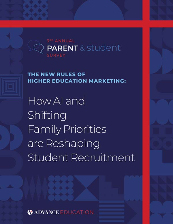
3rd Annual Parent & Student Survey
The New Rules Of Higher Education Marketing
How AI and Shifting Family Priorities are Reshaping Student Recruitment
AI isn’t new. It’s normal. Students and parents alike are increasingly using LLMs for research – for everything from homework help to their best options for higher education. If families already use AI to choose, the question is: how is your institution meeting them there? Our latest whitepaper outlines how to publish AI-readable answers to the most asked questions, making your value legible to both humans and machines.


